9 Tesla Quarterly Sales Charts
The 3rd quarter of 2023 was one of those rare quarters where Tesla had fewer sales (deliveries) than the quarter before. The reason for that seems to simply be that the company had to retool at its Shanghai factory for the release of its refreshed Tesla Model 3 (aka Model 3 Highland). That caused a pause in production that led to fewer deliveries. Whether that was just a blip on Tesla’s long rise up the sales ladder is what many people are still wondering and debating, especially in light of recent Tesla price cuts that seem to imply weakening consumer demand.
Whatever is going on over at Tesla and with its trajectory (or not) toward the 20 million cars the company aims to sell annually by 2030, let’s have a look back at the wild and crazy ride Tesla has been on quarter after quarter through Q3 2023.
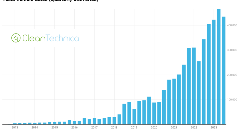
The rise from mid-2018 onward has been steep, and quite steady. There are quarterly dips here and there, but the trend is obviously upward, and upward fast. Any time sales dip or stagnate, questions of Tesla’s continued growth arise. Normally, a quarter or two later, Tesla sales are through the roof again. Does that mean we can expect the same in the coming years? Not necessarily. It’s just an interesting thing to look at this chart and think of those different moments in Tesla’s history and what people were saying at the time.
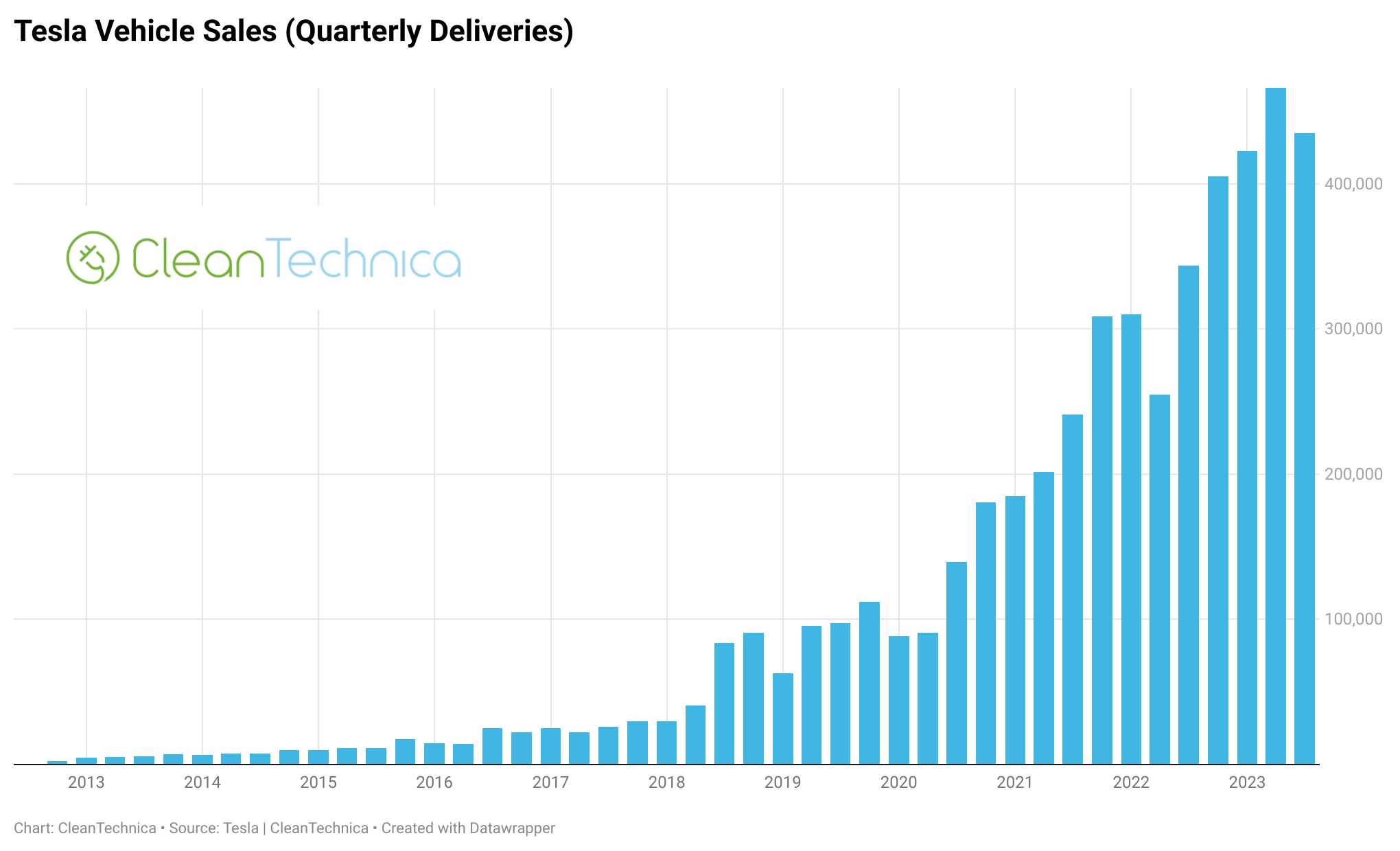
This second chart shows the same thing but with bars for each model stacked on top of each other for each quarter. Naturally, what stands out here is how the Model S & X disappeared in relevance, and how the Model Y bar just got bigger and bigger.

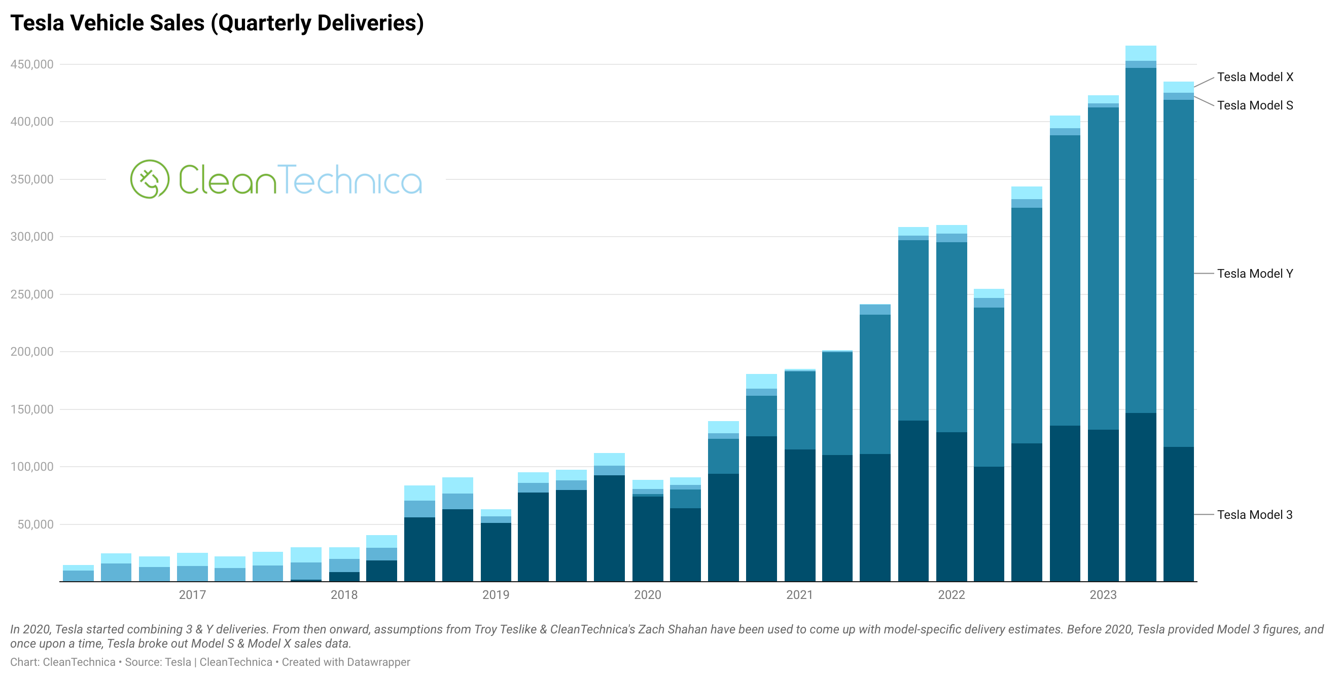
This line graph, believe it or not, shows the same thing in a different way. In another way, the same things thus jump out — the Model Y’s rising dominance, the Model 3’s rise and then stagnation, and the Model S & X just chugging along at the bottom. Note that individual model sales are estimates (very informed estimates) — Tesla doesn’t split out the numbers that much. What Tesla provides is these numbers:
The Tesla Model 3 & Y finally had another dip last quarter. The overall trend you see in that line graph, though, is rise upon rise upon rise — so steeply.

And then here’s a cumulative sales chart that demonstrates the exponential nature of Tesla’s growth. Stunning.
The remainder of the charts are interactive charts — first one set of four (in red) where you can toggle between each model’s quarterly sales over the years, and then interactive versions of the charts above. Note that these charts often don’t show well on phones — they are much better viewed on a normal computer.
Any remaining thoughts from all of these charts? Any charts you'd love to see that weren't included?
Have a tip for CleanTechnica? Want to advertise? Want to suggest a guest for our CleanTech Talk podcast? Contact us here.
Latest CleanTechnica.TV Video

CleanTechnica uses affiliate links. See our policy here.